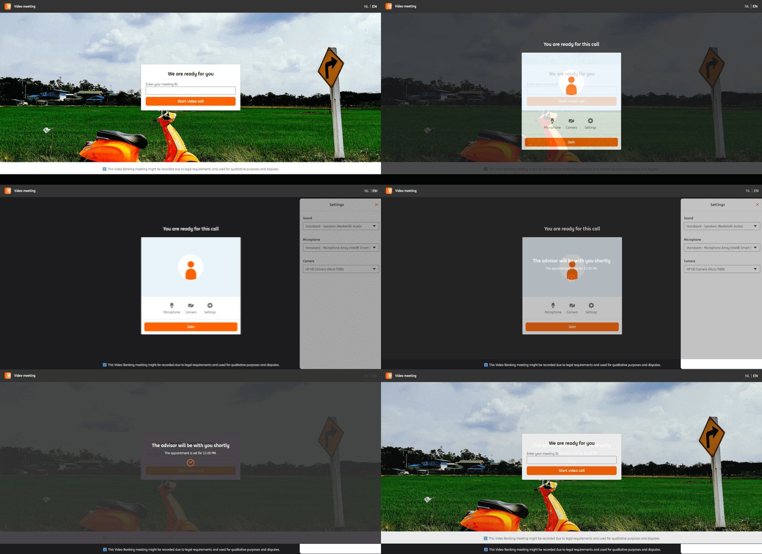
Video call with advisor
2022
 The waiting "lobby"
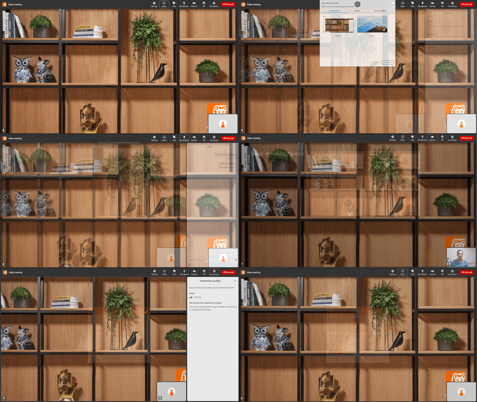
 In call screens
Get advice in the comfort of your home! With the Video call application, customers can schedule a video call with an advisor to get advice on various topics.
The video call can be done from web and mobile and includes features similar to industry standard video call solutions.
- User research
- Prototyping
- Interaction design
- Visual design
Bonnen & Facturen
2016

Don't want to lose your invoices and receipts? Don't know which bills you still need to pay or who needs to pay you? Scan and store them all in one place in our free Mobile Banking App! Convenient for your VAT declaration or your bookkeeper.
I worked this project from concept to production, including being the Product Owner.
- Product Owner
- Concept
- User research
- Interaction design
- Visual design
- HTML / CSS prototype (designed for mobile screen size)
Download ING Mobiel Bankieren app
The Guide
2014

The Guide is ING's first version of their Design System and enables quick design and development of new applications.
Designing for The Guide is a joint effort for UX and frontend dev at ING. I helped setting up this first version of The Guide, envangalizing it and designing the first components.
- Interaction design
- Evangalism
Accessibility
2013
Accessibility is very important for a large bank like ING. There are a lot of people amongst our millions of users who experience limitations while using the internet.
In 2013 I discovered we were lacking in our accessibility on some of our most essential applications and wrote a plan for a durable solution.
Now ING has a dedicated accessibility team which (amongst many other activities) runs audits and trains a growing group of accessibility champions.
- User research
- Evangalism
- Working together with local Accessibility workgroups (Oogvereniging, Stichting Accessibility)
iDEAL
2012

ING's iDEAL online payment system is used over 200.000 times a day. More and more visits are done on mobile devices. In 2012 I designed a new interface for mobile and web.
- Interaction design
- Usability research
Mijn ING inloggen
2012

Following the redesign of our banking environment (Mijn ING) I redesigned the login page. The project was mainly focused on the introduction of the PAC (Personal Authentication Code), a two factor authentication we send as sms as an extra protection against online fraud.
Imagine logging in with a device you never used before and from a place you never been before (on your holiday for example). In this type of situation we want to make sure it's you logging in and not some hacker. We can than ask you for an extra code: the PAC code. That way we can ensure it's you.
- Interaction design
- Usability research
 The waiting "lobby"
 In call screens


